Luxury Interior Design: How Space Planning Shapes Elegant Environments
Colour Strategies and Atmosphere in Upscale Canadian Homes
Neutral colour palettes continue to be a hallmark of luxury interiors in Canada, favored for their ability to cultivate a sense of calm and spaciousness. Common selections include warm greys, soft whites, muted taupes, and gentle earth tones. These hues are layered through wall finishes, textiles, and furnishings to create a cohesive atmosphere from room to room.
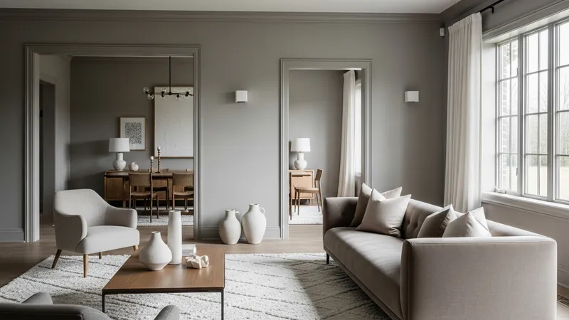
Many designers incorporate subtle gradients or a mix of matte and lightly reflective finishes to add depth, avoiding stark contrasts that may feel jarring in large, open spaces. This approach can help maintain visual continuity, making transitions between zones understated yet purposeful. The overall effect is an interior that feels both tailored and inviting.
Texture plays a significant role alongside colour in shaping the mood. Layered textiles such as oversized wool rugs, linen window coverings, and soft upholstery contribute to warmth and comfort—qualities particularly valued during Canadian winters. These additions can balance the clean lines and controlled palettes, offering tactile interest without disrupting the design’s restraint.
Occasionally, vibrant accents are introduced through art, sculpture, or statement furniture, providing focal points while keeping the primary palette neutral. This allows for flexibility, as these features can be rotated or updated according to changing tastes or seasonal preferences without necessitating a complete redesign of the core space.